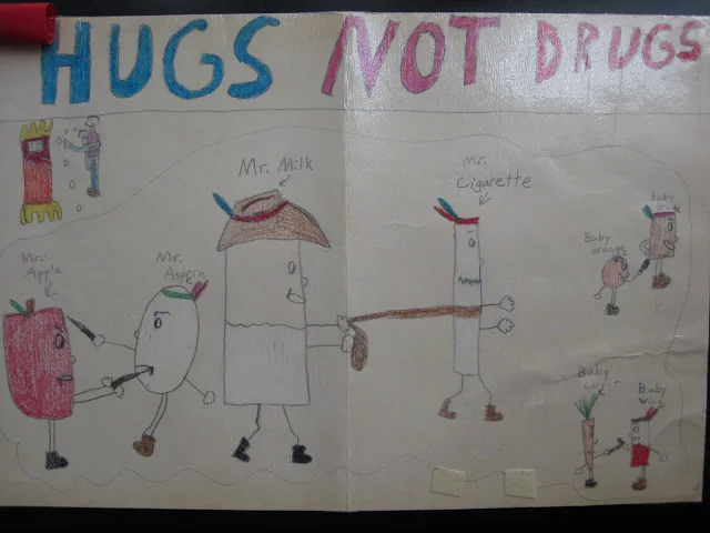
Ladies and gentlemen, I submit for your review the poster I designed in second grade for an anti-drug campaign. You can tell this was an important artistic work, because it's laminated.
Let's break this down, shall we?
So it looks like we have a little kid clinging to his father in the upper left-hand corner, and he's recounting a crazy-ass dream he had. Or maybe he just doesn't want to get back into that nightmare of a bed with what appears to be giant claws on either end.
What's happening in the dream?
In the center we have Mr. Milk lassoing Mr. Cigarette in a bizarre cowboy vs. Indian tableau. They actually don't look terribly unhappy. However, things get more serious on the outskirts. On the left we have Mr. Apple stabbing Mr. Asprin (who evidently is already wounded, since he's missing an I) in the mouth. I'm not sure why aspirin makes the cut of dangerous illegal substances, but there you have it.
On the right, we have the young fruits and vegetables engaged in a Lord of the Flies situation, armed to the teeth and out for blood. At the top, Baby Orange is poking Baby Drug (must be a generic) in the ass with a dagger. Below that, Baby Carrot is dueling with Baby Wine (though shouldn't he really be just a grape?)
But the best part is that, above all this violence and chaos, is the overarching message of "Hugs Not Drugs." Because clearly Mr. Milk and his associates are winning the day with love. Did anyone, at any point during the creation of this elementary school propaganda masterpiece, think to point out that perhaps I shouldn't illustrate my thesis with a crying child and a group of slightly racist characters locked in mortal combat? No. No, they did not.
Or maybe they did, and I ignored them. What matters is that I won second place, as evidenced by the red ribbon on the top left. So suck it, logic and good taste. You've never been key players in the war on drugs, anyway.
